THE FRAME
Lowengagementandzerocompetitiveincentiveinaperformancesystemnoonewantedtoopen.
Logistics Legends League· UX Case Study
Pick your pace

0
User Roles
0
Regions
0+
Contributors
THE FRAME
Logistics Legends League· UX Case Study
Pick your pace
0
User Roles
0
Regions
0+
Contributors
THE CHALLENGE
Logistics Legends League had avatars, XP, badges, and leaderboards - but it was all buried inside PowerBI dashboards and manually-maintained Excel sheets. Contributors had no reason to check their own data because the experience wasn't designed for them.
0 / 8
contributors could name their own SLA score
6+ hrs/wk
per supervisor on manual game admin
7 regions
dependent on individual supervisor availability
“People perform differently when there is a milestone.”
Stakeholder interview - the guiding principle behind every design decision
PROCESS
8 interviews, 4 regions
Nobody knew their own score - engagement problem, not a UI problem
Supervisor shadowing, 3 sites
The game layer cost supervisors 6+ hours/week in manual admin
4-week A/B pilot
Individual leaderboards tripled daily check-ins vs. regional ones
Responsive web platform
Single app replaced PowerBI + Excel + manual email workflows
KEY DECISIONS
Regional rankings let low performers hide behind the group score. Individual boards with regional identity kept intact tripled daily check-ins.
Same gamification building blocks, completely different experience. Users in initial testing called it the single biggest reason they wanted to come back.
Desktop-only to fully responsive. The habit forms when the platform fits into the workflow - on breaks, on the floor, on the go.
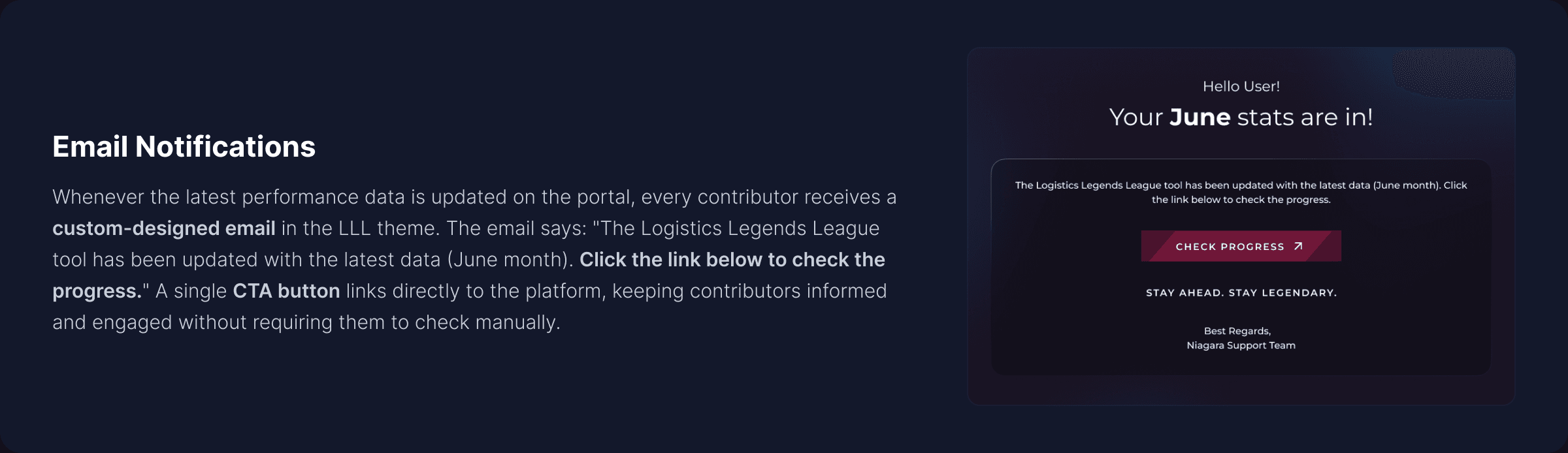
Custom LLL-themed emails with a direct link, sent every time data refreshes. Turned silent updates into an active pull mechanism.
Social Loafing - When individual effort is hidden behind group scores, people naturally contribute less. (Karau & Williams)
The N-Effect - Motivation drops as the competitor pool grows. 200+ people on one board means nobody tries. (Garcia & Tor)
Real-World Proof - Kenco switched to individual leaderboards: 45% profit increase, 3x KPI improvement in 3 months.
BEFORE & AFTER
The Old Way
PowerBI dashboard. Built for reporting, manually maintained, nothing to draw contributors in.
The New Platform
Responsive web platform. Self-service access across 3 devices, current stats and leaderboards on demand.
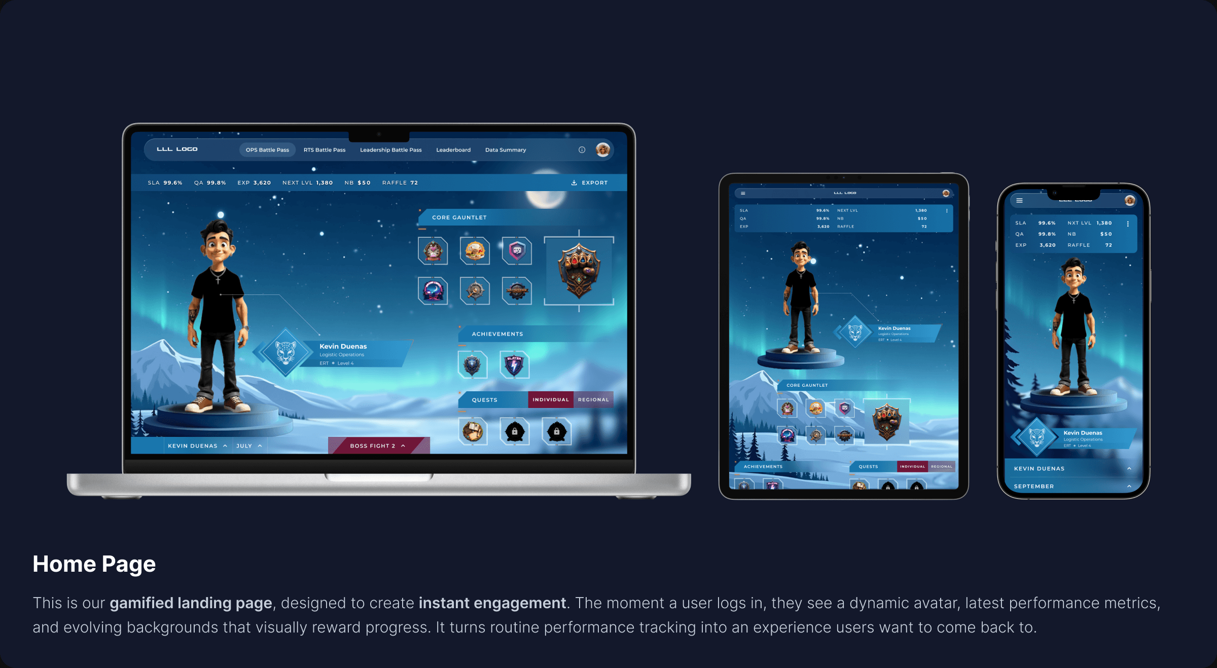
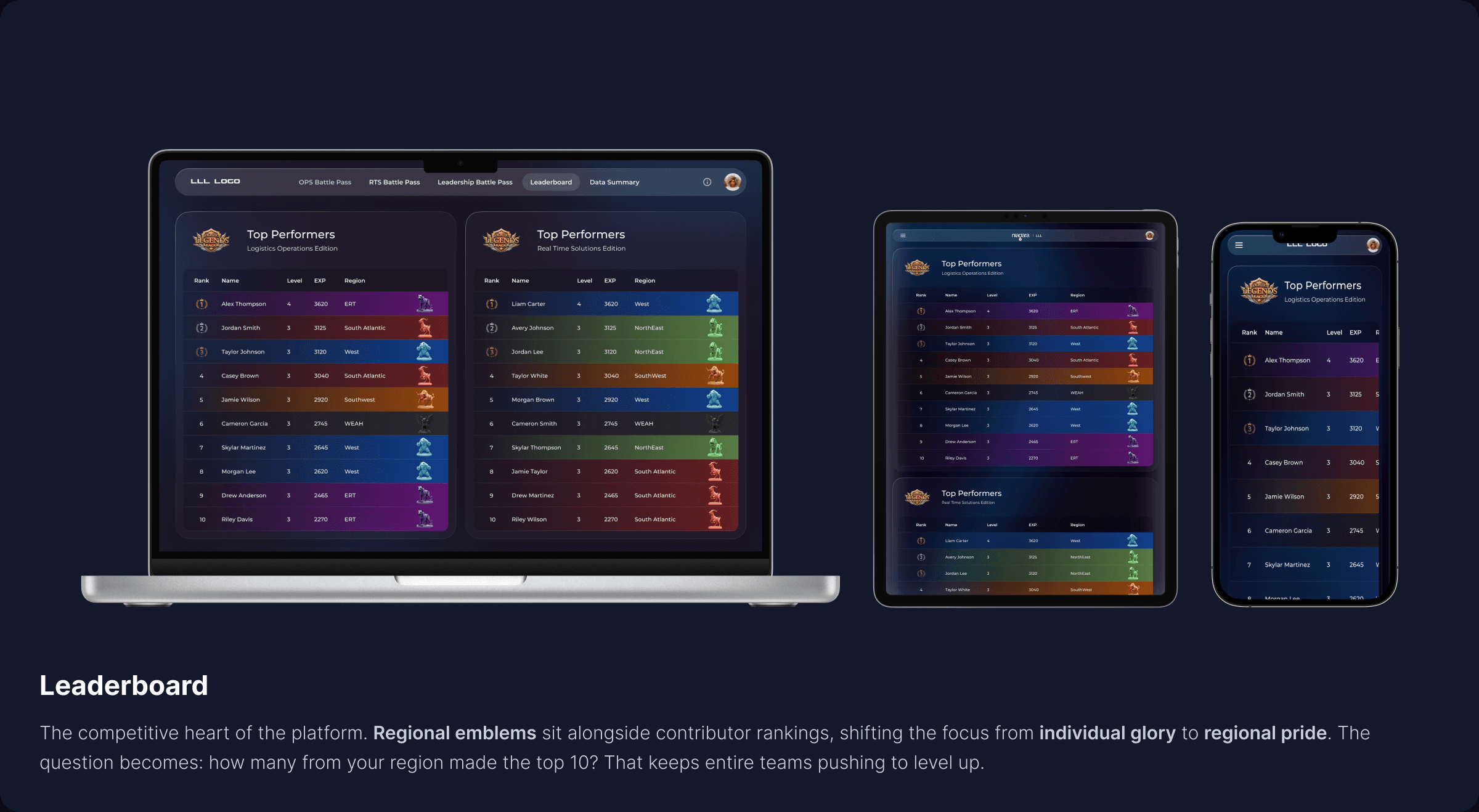
MAJOR SCREENS
IMPACT
↑
3x
Daily Check-Ins
↓
3 → 1
Tools Consolidated
↓
~6 hrs/wk
Supervisor Effort Saved
↑
34%
Email Click-Through
↓
Zero
Regional Data Blackouts
↑
10 days
First Feature Request
REFLECTION
The current platform is responsive, not adaptive. If mobile turns out to be the primary access point, build a version designed for quick glances and one-hand navigation.
Monthly updates are too slow for habit formation. Weekly or bi-weekly refreshes would tighten the feedback loop and make competition feel continuous.
Tiny trend lines beneath each stat card value - no labels, no axes. A visual nudge that tells you at a glance whether your SLA is climbing or dipping.